
App Store Screenshots That Convert: How to Design the First Thing Users Actually See
Your app store screenshots are the single highest-leverage conversion asset on your listing. Most indie developers treat them as an afterthought. Here is how to design screenshots that turn browsers into downloaders.
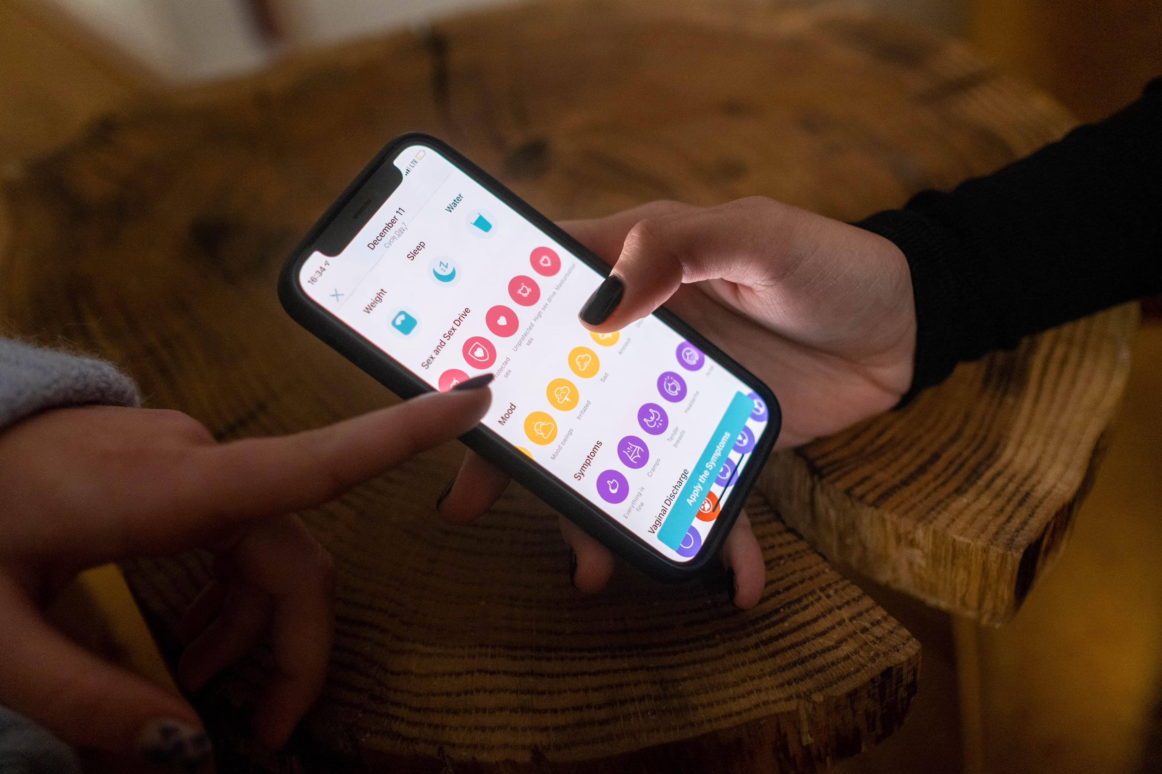
When a user finds your app in a search result, the screenshot strip is often the first thing they see — before they read the title, before they check the rating, and long before they read the description. Eye-tracking studies of app store behavior consistently show that users make their initial impression of an app from the screenshots in the first two to three seconds of viewing a listing. If those screenshots do not communicate immediate value, most users move on without reading anything else.
Despite this, most indie apps ship with screenshots that are effectively product tours: a series of screens showing what the app looks like, with no copy, no context, and no attempt to communicate why a user should care. These screenshots may be accurate representations of the product. They are almost never effective conversion assets.
Screenshots Are Advertising, Not Documentation
The mental model shift that transforms screenshot quality is understanding that each screenshot is a piece of advertising, not a product tour slide. Its job is not to show the user what the app looks like — it is to convince the user that this app will solve their specific problem better than anything else in the search results.
This distinction changes every design decision. Advertising communicates a benefit and creates desire. Documentation shows a feature and expects the viewer to understand its value. A screenshot of your invoice creation screen is documentation. A screenshot that shows the same screen with overlay text reading "Send professional invoices in under 60 seconds" is advertising — it tells the user what they will be able to do, which is the thing they actually care about.
Every screenshot in your set should be asking and answering the question: "Why does this matter to the person looking at it?"
The Screenshot Architecture That Converts
Structure your screenshot set as a sequential argument rather than a random feature showcase. The first screenshot is the most important — it needs to communicate your app's core value proposition in a single glance, because it is the only screenshot visible in search results on most device sizes without tapping to expand.
Screenshot 1 should present your single strongest benefit, targeted at the exact type of user most likely to search for your app. Use bold, legible headline copy over or below the device mockup. The copy should be outcome-focused: not "Beautiful Invoice Templates" but "Get Paid Faster With Invoices Clients Actually Open." The device mockup should show the app at its most compelling moment — not a settings screen, not an empty state, but the moment where the app's value is most visually obvious.
Screenshots 2 and 3 handle the next two most important benefits or the next most significant features that differentiate your app from competitors. Screenshots 4 and 5 can address common objections or secondary features that support the primary value proposition. Social proof — a rating badge, a media mention, a brief testimonial — works particularly well in the final screenshot position.
Device Frames, Backgrounds, and Typography
The visual quality of your screenshots signals the quality of your app. A screenshot set with amateur typography, inconsistent background colors, or blurry device frames communicates that the app itself may be similarly unpolished — and gives users who were already uncertain a reason to choose a competitor.
Device frames should be current — the most recent device silhouettes available for the platform you are targeting. Both Apple and Google regularly update the device frames used in featured placements, and using outdated frames dates your listing visually.
Background colors and gradients should be consistent across all screenshots in the set, creating a cohesive visual identity that stands out in the horizontal scroll of search results. Users scroll through search results quickly; a screenshot set with a distinctive, consistent visual treatment is recognized as a single brand identity, which creates the impression of a more polished product.
Typography should be large enough to be legible at small sizes — test your screenshots at the thumbnail size they appear in search results, not at the full resolution you designed them at. A headline that looks well-proportioned in your design tool can be completely unreadable as a search result thumbnail.
A/B Testing Your Screenshots
Both the App Store and Google Play offer native tools for testing alternative screenshot sets against the live version of your listing. This is one of the highest-leverage optimization opportunities available to an indie developer, because even a modest improvement in listing conversion rate produces a sustained increase in organic downloads.
Start by testing your first screenshot, since it has the highest impact on conversion. Create two versions that use different benefit framings — test an outcome-focused headline against a problem-focused headline, or test two different moments in the app as the hero visual. Run the test for at least two weeks and enough impressions to produce statistically meaningful results.
After the first screenshot is optimized, test the second and then the third. Each optimization builds on the previous one, and the cumulative effect of three improved screenshots is significantly larger than any individual improvement in isolation.
Localizing Screenshots for Different Markets
If your app is available in multiple languages or markets, localized screenshots — screenshots with copy in the local language that reference local context — consistently outperform English-language screenshots in non-English markets, even when the app itself is available in the local language.
Localization does not need to be perfect to be effective. Machine translation reviewed by a native speaker is sufficient for screenshot copy, which is brief and benefit-focused by design. The investment in localized screenshots for your two or three largest non-English markets will typically produce a measurable increase in conversion rate in those markets within the first month.
The screenshot set is not a launch deliverable — it is an ongoing marketing asset that deserves the same iterative attention as any other growth lever in your app's acquisition funnel.