
The SaaS Landing Page Formula That Converts Cold Traffic
Most SaaS landing pages are built to impress other founders. The ones that convert cold visitors into trials follow a specific structure rooted in how buyers actually make decisions. Here is that structure.
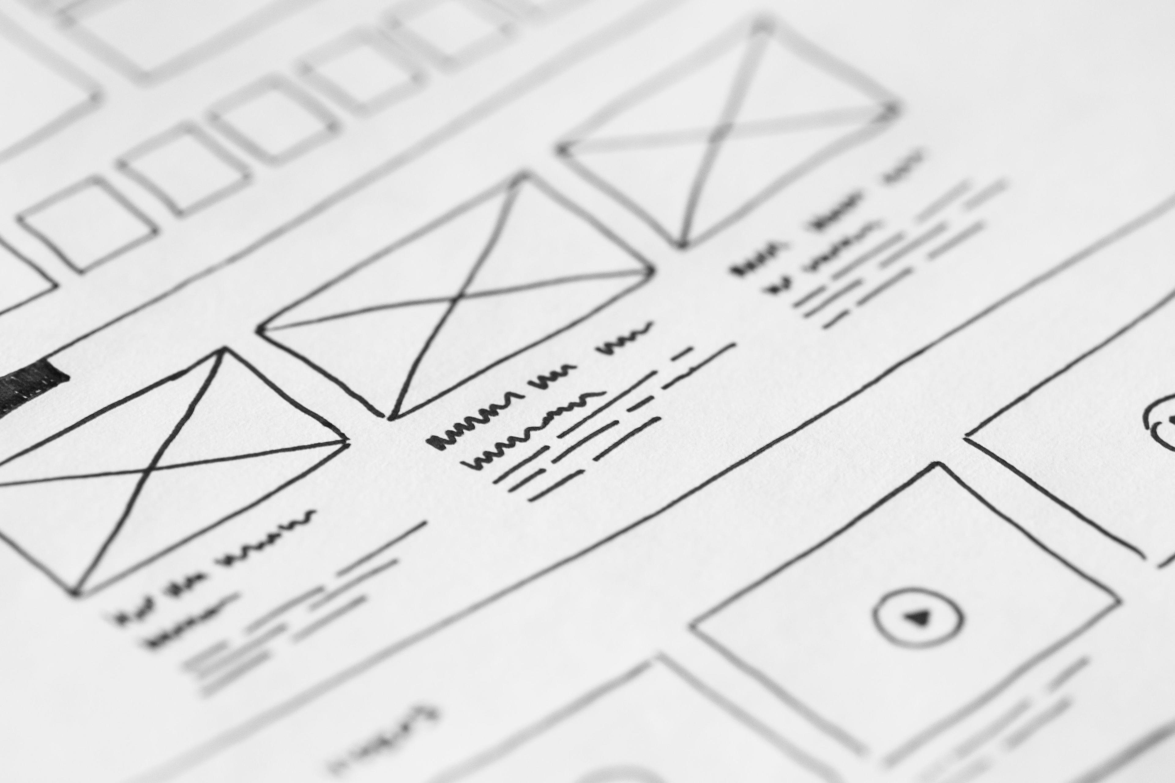
A SaaS landing page has one job: to convert a visitor who knows nothing about your product into someone who is willing to start a trial. Every design decision, every copy choice, every section and element should be evaluated against that single objective. Most SaaS landing pages fail this evaluation not because they lack design quality but because they are structured around the product rather than around the visitor's decision-making process.
The visitor who arrives at your landing page from a cold source — a search engine, a social post, an ad, a mention in a newsletter — is asking a sequence of questions in a specific order. A landing page that answers those questions in that order converts. A page that answers different questions, or the right questions in the wrong order, creates confusion at exactly the moments when the visitor is deciding whether to stay or leave.
The Question Sequence Cold Visitors Follow
Cold visitors arrive with no prior relationship to your product and a limited attention span. Research on SaaS landing page behavior consistently shows that the average cold visitor makes their initial stay-or-leave decision in the first five to eight seconds of the page loading. The first question they are asking in that window is: "Is this for me?"
This question is answered — or not — by the hero section: the headline, the subheadline, and the visual above the fold. If the hero section communicates clearly who the product is for and what it does for them, the visitor stays. If it leads with a generic value statement that could describe any number of products, or with a product screenshot that requires context to interpret, most cold visitors leave.
The subsequent questions, in order: "Can this actually solve my problem?" (answered by the problem section and the feature demonstrations), "Have other people like me used it successfully?" (answered by social proof), "What will I have to give up or risk to try it?" (answered by the trial terms and pricing), and "What do I do now?" (answered by the call to action).
Writing the Hero Section That Keeps Visitors
The headline should communicate the outcome your product delivers for a specific type of user, in plain language that the user themselves would use. Not "The Future of Workflow Automation" — that could mean anything. "The Easiest Way for Freelance Designers to Invoice Clients and Get Paid on Time" communicates outcome, audience, and relevance in one sentence.
The subheadline does one of two things: it adds specificity to the headline's claim, or it handles the most common objection to the headline's promise. If the headline makes a bold claim, the subheadline can quantify it or provide a second dimension of proof. If the headline addresses a specific use case, the subheadline can extend the audience or add a secondary benefit.
The hero visual should show the product in action at the most compelling moment — not a generic dashboard overview, but the specific screen or interaction that makes the product's value most obvious. A before-and-after, a short screen recording of the key flow, or a product screenshot annotated with outcome labels all outperform static product mockups for cold traffic conversion.
The Problem Section Nobody Writes
Most SaaS landing pages skip the problem section entirely, jumping from the hero to a feature grid. This skip is expensive: it removes the section that creates the emotional resonance necessary to make a visitor feel that this product was built for their specific situation.
A problem section describes the frustration, inefficiency, or cost that the product's target user currently experiences — in their language, with specificity that makes the description feel like it was written about them. This section is brief — three to five sentences or a short bulleted list of pain points — but its effect on conversion is disproportionate to its length. A visitor who reads the problem section and thinks "yes, this is exactly my situation" is now looking for reasons to try the product rather than reasons to leave the page.
The content for this section comes directly from customer research: the language used in user interviews, in support tickets, in community discussions, and in the reviews of competing products. If you have done the research, you have the copy. If you have not, this section will ring hollow and visitors will know it.
Social Proof That Converts
Social proof on a SaaS landing page is most effective when it is specific, recent, and from people the target visitor can identify with. A generic five-star review with no context converts poorly. A testimonial that describes a specific outcome — "I used to spend four hours a week on client invoicing. With [product], it takes twenty minutes." — from an identified person with a visible role and company, converts significantly better.
The most effective placement for social proof is immediately after the section that makes a claim. The hero section makes a claim about outcome; a brief social proof element beneath it validates the claim. The pricing section asks the visitor to make a commitment; a testimonial specifically addressing value for money immediately above the pricing table reduces the friction of that commitment.
For early-stage products without extensive testimonials, a small number of high-quality, specific testimonials outperforms a grid of generic five-star ratings. Ask three to five of your best users for specific, outcome-focused testimonials and feature them prominently rather than filling the page with quantity.
The Pricing Section That Does Not Scare People Away
Pricing is where many SaaS landing pages lose visitors who were close to converting. Common mistakes: hiding pricing behind a "Contact Us" link (appropriate for enterprise, damaging for self-serve), presenting pricing without context that makes it feel justified, and using tier names that do not communicate who each tier is for.
Name your tiers after the customer segment they serve, not after precious metals or arbitrary tier labels. "Solo," "Team," and "Agency" communicate immediately who each plan is designed for. "Starter," "Pro," and "Enterprise" require the visitor to read the feature comparison to understand which applies to them — and many visitors do not.
Present the annual pricing option prominently and make the savings calculation explicit. "Save $X per year" is more motivating than "2 months free" even if they are mathematically equivalent, because the dollar amount is concrete and the savings feel immediate.
The Call to Action That Closes
The primary call to action should appear at minimum in the hero section and at the bottom of the page, and ideally at one or two natural moments of momentum in between — typically after the social proof and after the pricing section.
The CTA copy should name the action and reduce the perceived risk simultaneously. "Start Free Trial" is functional but generic. "Start Your 14-Day Free Trial — No Credit Card Required" is specific about what the visitor is committing to, how long it lasts, and what they do not have to give up to try it. Each additional piece of specificity reduces the perceived risk of clicking and increases conversion.
The landing page is never finished. Every traffic source that hits it, every session recording you watch, and every conversion rate you measure is data about what is working and what is not. Treat it as a living document — and update it the way you update your product.