
Typography for UI Designers: Choosing Fonts, Building Type Scales, and Designing for Readability
Typography carries most of the information in any interface, yet it is usually the least deliberate part of a design. Here is a practical system for choosing typefaces, building a type scale, and making text readable at every size.
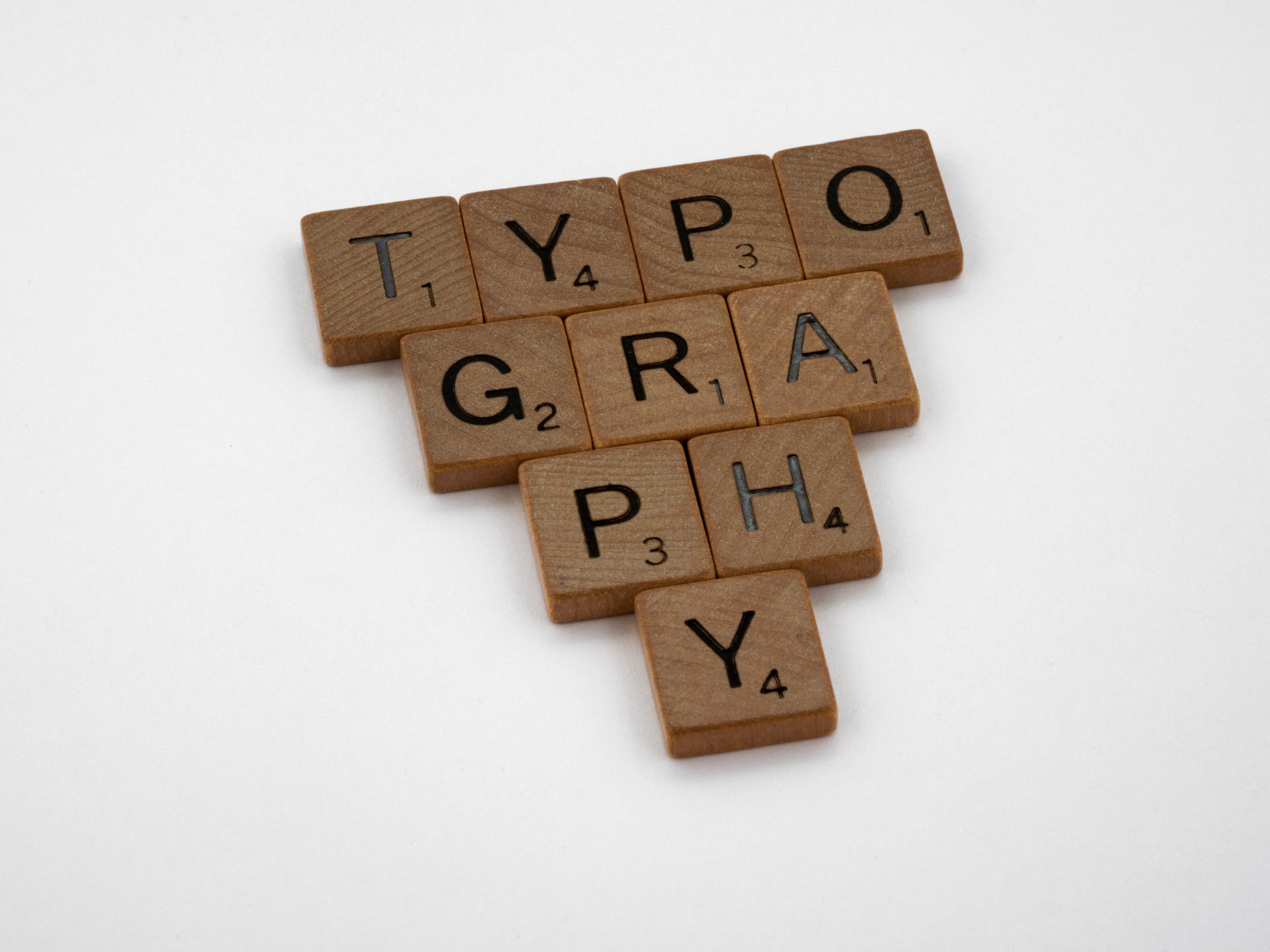
Strip the color, the icons, and the imagery out of almost any interface and what remains is text. Labels, headings, body copy, button text, error messages, table data — the overwhelming majority of what users read and act on is typography. That makes type the single most load-bearing element in UI design, and yet it is often the least deliberate. Designers spend hours on a color palette and minutes on the type system, then wonder why the interface feels slightly off.
Good UI typography is not about finding a beautiful font. It is about building a system of sizes, weights, and spacing that creates clear hierarchy, reads comfortably at every screen size, and scales consistently as the product grows. This guide covers the decisions that matter most.
Why Interface Typography Is Different From Editorial Typography
Editorial typography — books, magazines, long-form articles — optimizes for sustained reading. The reader sits with the text for minutes or hours, and the typographic decisions serve comfort over that span.
Interface typography optimizes for scanning and action. Users rarely read an interface; they scan it for the label, number, or button that gets them to their goal. That changes the priorities. Legibility at small sizes matters more than elegance at large ones. Distinct weights matter more than decorative details. Numerals need to align in tables. Labels need to stay readable at 12 or 13 pixels on a low-density screen.
This is why many display typefaces that look striking in a brand guideline fall apart in a product. They are designed for headlines, not for a 13-pixel table cell or a form label crammed next to an input field. The question to ask of any typeface is not "does it look good?" but "does it stay clear at the smallest size I will use it?"
Choosing a Typeface That Works in Product
For most products, a single well-built sans-serif family will handle everything. Pairing typefaces is an advanced move that adds personality but also adds risk; a single family with a full range of weights is the safer and more consistent default.
When evaluating a typeface for UI use, check these properties:
- Large x-height. Lowercase letters that are tall relative to capitals stay legible at small sizes.
- Open apertures. Letters like "c," "e," and "a" with wide openings are easier to distinguish when rendered small.
- Distinct similar characters. Uppercase "I," lowercase "l," and the numeral "1" should be clearly different, which matters for passwords, codes, and data.
- Tabular figures. Numbers that share a fixed width allow columns of figures to align, which is essential for dashboards and pricing tables.
- A full weight range. At minimum regular, medium, and semibold or bold, so hierarchy can be built without changing size.
Typefaces such as Inter, IBM Plex Sans, Source Sans, and the system UI stacks were built with these properties in mind, which is why they appear in so many products. They are not exciting choices, but they are reliable ones — and reliability is what an interface typeface is for.
Building a Type Scale
A type scale is a fixed set of sizes your product is allowed to use. Without one, sizes drift: a 15-pixel label here, a 17-pixel heading there, until the interface contains a dozen nearly identical sizes that create visual noise rather than hierarchy.
The common approach is a modular scale, where each step is the previous step multiplied by a ratio. A ratio of 1.2 (minor third) produces a tight scale suited to dense, data-heavy products. A ratio of 1.25 (major third) gives a bit more contrast and works well for most SaaS interfaces. Ratios of 1.333 or higher produce dramatic jumps that suit marketing pages more than product screens.
In practice, most products need far fewer sizes than designers expect. A workable product scale often looks like this: 12px for captions and metadata, 14px for secondary text and dense UI, 16px for body text, 20px for section headings, 24px for page titles, and 32px or larger for marketing or hero headlines. Six or seven sizes cover the vast majority of needs. Round each value to a whole pixel and name them by role — caption, body, title — rather than by number, so the system communicates intent.
Hierarchy Without Shouting
Beginner designers create hierarchy by making important things bigger. Experienced designers use the full set of levers: size, weight, color, and spacing, often adjusting two or three together by small amounts rather than one by a large amount.
A secondary label does not need to be smaller than the primary one — it can be the same size in a lighter weight and a lower-contrast color. A page title does not need to be enormous if it is set in a heavier weight with generous space below it. Combining subtle changes produces hierarchy that feels calm and controlled rather than loud.
A useful exercise is to squint at your screen or blur a screenshot. The elements that remain distinguishable are the top of your hierarchy. If everything blurs into the same gray mass, the hierarchy is too flat. If three or four elements fight for attention, it is too loud. Aim for one clear primary element per view, a small number of secondary elements, and everything else quietly supporting them.
Line Height, Line Length, and Spacing
Size gets the attention, but spacing determines whether text is comfortable to read.
Line height should scale inversely with size. Body text at 14–16px reads well at a line height around 1.5. Headings at 24px and up need tighter line heights, often between 1.1 and 1.3, because the large default spacing makes multi-line headings feel disconnected. A single line-height value applied to every size is one of the most common reasons type systems look amateur.
Line length — the number of characters per line — matters for any text longer than a sentence or two. Somewhere between 50 and 75 characters per line is the comfortable range for reading. Long lines make the eye lose its place when returning to the start of the next line; very short lines create a choppy rhythm. In a wide layout, constrain the width of text containers rather than letting paragraphs run the full width of the screen.
Letter spacing generally needs a light touch. Large headings often benefit from slightly negative tracking to feel tighter. Small all-caps labels benefit from slightly positive tracking to stay legible. Body text should usually be left at the typeface's default.
Typography in Dark Interfaces
Dark interfaces introduce a specific typographic problem: light text on a dark background appears heavier and brighter than the same weight of dark text on a light background. The result is that text can feel harsh or bloated, and thin weights can shimmer.
Three adjustments help. First, avoid pure white text on near-black backgrounds for long passages; a slightly reduced brightness such as an off-white or a light gray reduces glare while keeping contrast well above accessibility thresholds. Second, consider stepping down one weight for body text if it looks heavy. Third, use color and opacity rather than very thin weights to signal secondary text, since hairline weights degrade quickly on dark surfaces.
Whatever adjustments you make, confirm that text still meets a contrast ratio of at least 4.5:1 for normal text and 3:1 for large text. Reduced brightness should never come at the cost of accessibility.
Turning Type Decisions Into Tokens
A type system only stays consistent if it is encoded somewhere developers and designers both reference. Define each text style as a named token that bundles size, line height, weight, and letter spacing together: text-body, text-body-strong, text-caption, text-title, and so on.
Bundling matters. If size and line height are separate tokens, someone will eventually pair a heading size with a body line height and the result will look broken. A single token per role prevents that drift. In Figma, these become text styles; in code, they become utility classes or CSS custom properties that map to the same names.
Once the tokens exist, the rule is simple: no text in the product uses a value that is not in the system. Exceptions can be added deliberately when a genuine need appears, but they become new tokens, not one-off overrides.
A Quick Typography Audit
If you are working on an existing product, run a short audit before redesigning anything. Collect every distinct font size, weight, and line height currently in use — browser developer tools or a design linting plugin make this straightforward. Most products that grew without a type system will reveal fifteen or twenty sizes where six would do.
Map each existing usage to the closest step in a new scale, then replace them in priority order: navigation and primary actions first, then body content, then edge cases. The visual improvement from collapsing a messy set of sizes into a deliberate scale is often larger than any color or layout change you could make, and it costs far less effort. Typography is the foundation the rest of the interface stands on — get it consistent, and everything built on top of it looks more considered.